It’s always easy to start decorating with white, but it also requires conscious effort to get an appealing, inviting result. Here’s how.
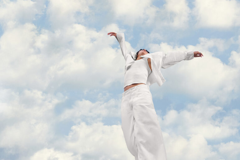
Decorating with white creates a sense of purity, simplicity, spaciousness, and new beginnings. That is why Pantone’s announcement of the color of the year, Cloud Dancer, was a real breath of fresh air for many home enthusiasts and designers. It is widely viewed as an international reset, allowing everyone to move away from more saturated hues to create environments that put clarity, comfort, and serenity at the front and center.
Pantone describes Cloud Dancer as an “ethereal white hue” that provides a calming influence “in a frenetic society.” It is a blank canvas that quiets the mind, “encouraging true relaxation and focus that allows the mind to wander and creativity to breathe, making room for innovation.”
Related story: Pantone’s Color of the Year 2026 brings calm to a noisy world
It is a “conscious statement of simplification, enhancing our focus, providing release from the distraction of external influences,” says Pantone Color Institute Executive Director Leatrice Eiseman. Still, decorating with this off-white shade can also feel cold, sterile, or bland without careful execution.
White, after all, has been widely perceived as a standard, default color. The selection got some enthusiasts into thinking that Pantone was being “too safe” and lacks the dynamic impact expected from a “color of the year” announcement. And when it comes to decorating, it is always easy to start with white, but it also requires conscious effort to get a sophisticated, inviting result.
To help you with that, we asked two interior designers, Kleina Guillen and Angielee Morales, for advice on how to breathe new life into your home using Cloud Dancer. When used correctly, this standard hue can bring function and feeling into a space, building an atmosphere of serenity and spaciousness that benefits your well-being.
Related story: How to use lighting to make your house look expensive
Related story: The art of curation: A guide to making intentional choices for your home
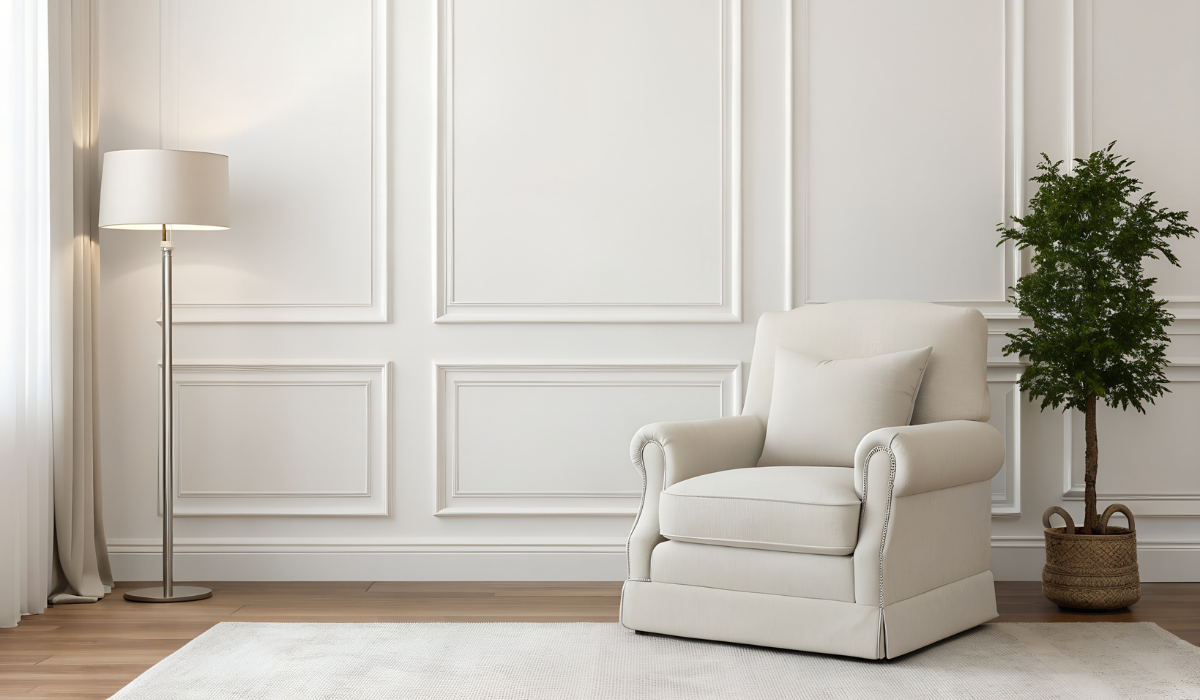
Create energy with deep, vibrant, or metallic colors
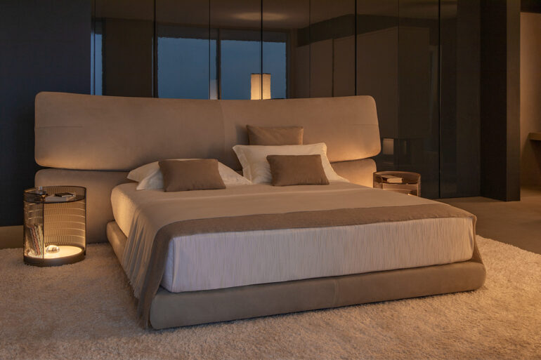
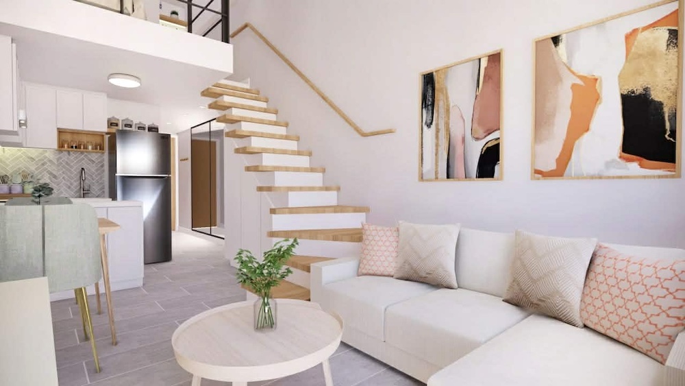
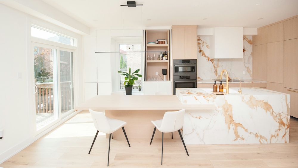
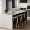
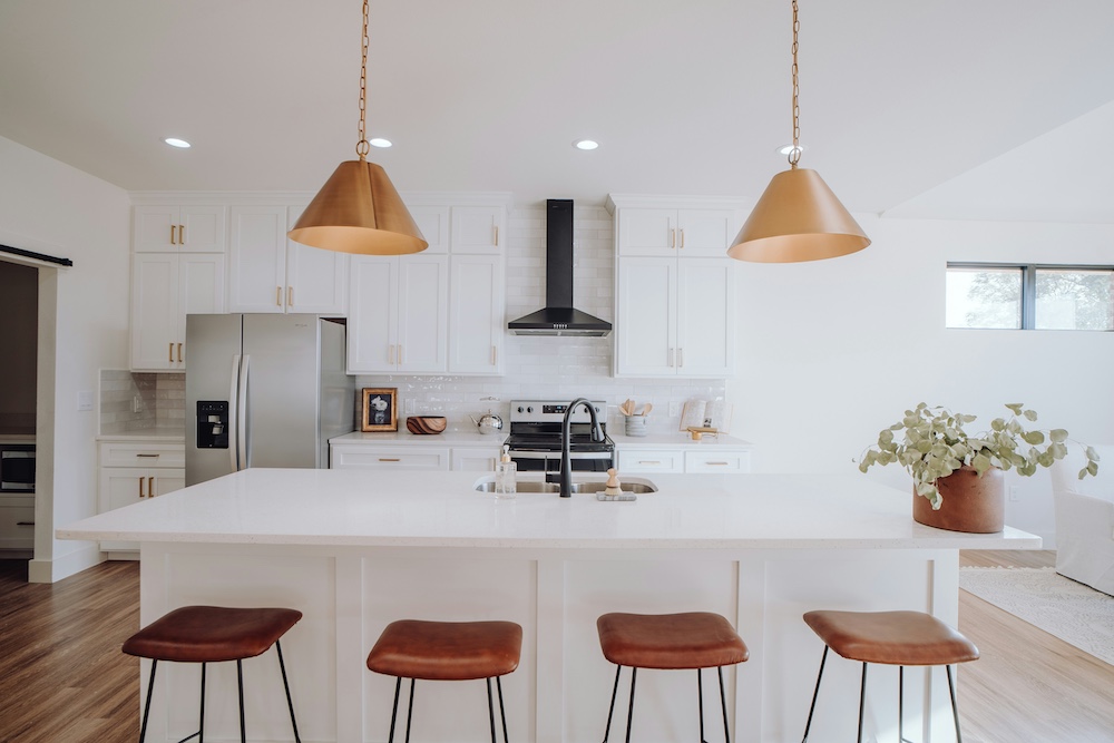
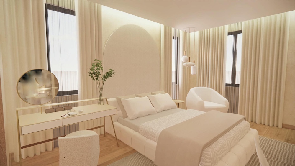
Cloud Dancer, as described by Pantone, “introduces a spa-like feeling into bathrooms and an open and spacious feeling in the kitchen.” In the living room, this airy shade “brings a welcoming calmness” and “suggests a state of response and tranquility to a bedroom,” according to Guillen. “When mixed with other colors, it can somehow relax the active mind of a child when applied in a playroom,” she added.
Versatility is a key factor in Cloud Dancer’s likeability and function. You can pair it with almost any hue, from soft pastels to rich, deep tones. But if you want a space that brims with life or whispers sophistication, Guillen and Morales recommend mixing it with vibrant colors or metallics.
“Any color can be used with Cloud Dancer as it is a natural white color,” said Guillen. “Pair it with any vibrant pops of color for bolder accents. Or, use it together with metallics such as brass, copper, or champagne gold for a touch of sophistication.”
If used only as an accent, Cloud Dancer is best paired with deep colors, according to Morales. “Go for richer or deeper colors as the main tone. Think navy, charcoal, forest green, or warm gray. Cloud Dancer pops against these shades, making trims, furniture, or decor details stand out.”
Find peace and serenity in soft neutrals
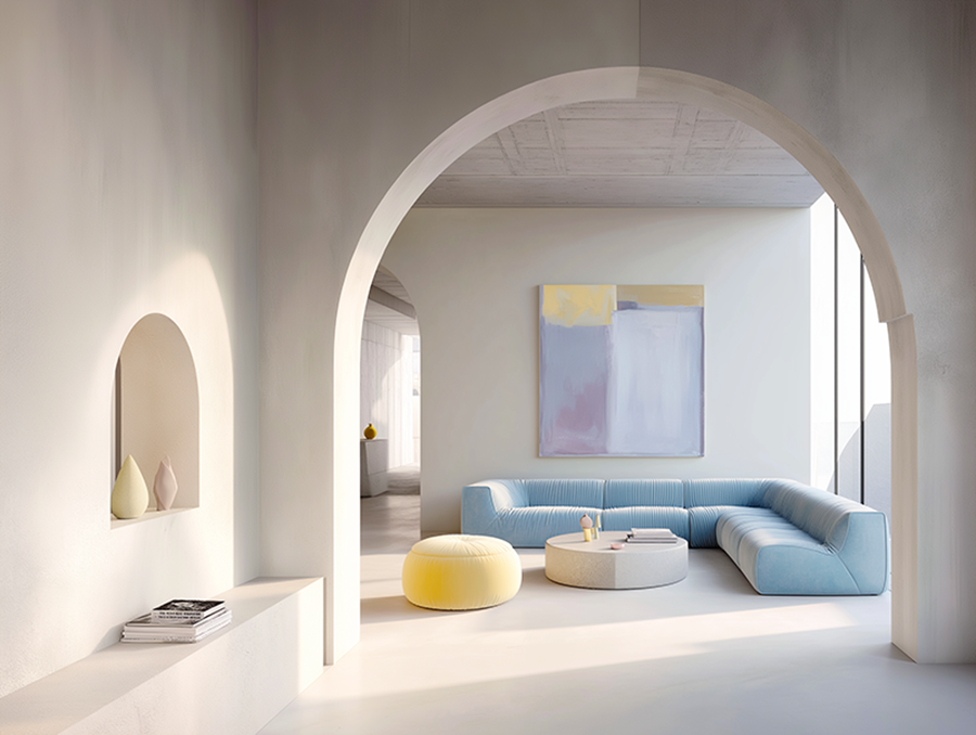
Cloud Dancer sets the tone for a calm, restful atmosphere. Its name evokes floating clouds, suggesting a feeling of lightness, airiness, and freedom. To maximize its ability to bring serenity to a space and a busy mind, pair it with the most soothing color spectrum: neutrals.
“It pairs well with soft neutrals like griege or taupe, earthy tones like terracotta and olive, or muted pastels like dusty blue and blush. Matte black adds nice accents, too,” Morales told The POST.
If you decorated your house with 2025’s color of the year, mocha mousse, you need not worry about having to clear up your space to make way for Cloud Dancer. Guillen, instead, advices mixing them together to create a timeless design for your home.
“Layer it with neutrals such as mocha mousse or beige for an organic feel,” she said. “Basically, you can mix Cloud Dancer with anything that complements its gentle warmth,” Morales added.
Related story: A tale of two stunning designs
Related story: Design icons you must (finally) get for yourself this year
Incorporate calming, soothing materials
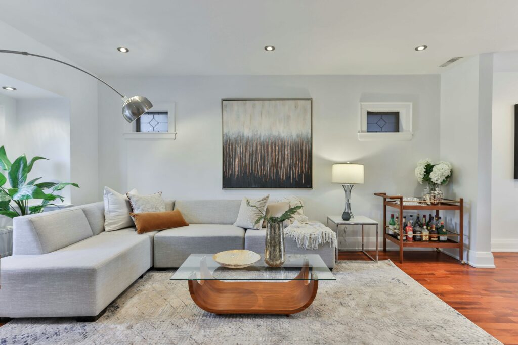
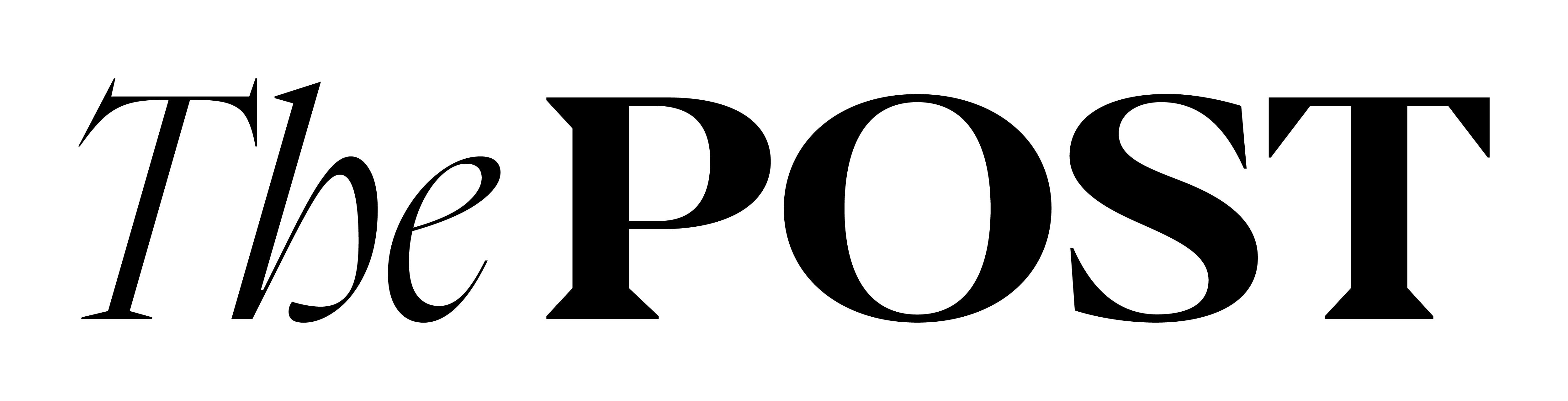
When creating a tranquil, healing space, it’s best to know which neutrals to use and, at the same time, the materials that will promote mindfulness, rest, and relaxation. White can sometimes feel stiff, boring, or restrictive and incorporating calming materials into it will produce a rather soothing effect.
“Pair it with wood accents for warmth. They create a clean, bright, and calming space without feeling cold,” Morales said. Guillen elaborated, “Adding organic elements such as light oak wood flooring, griege (gray-beige) carpets, and sandstone beige accent walls can introduce subtle accents without overpowering the serenity. Then, pair them with natural white (Cloud Dancer) tables, chairs, and other furniture.”
Play with texture
Texture is a key element in creating depth, balance, and personality in any space. It instantly elevates a room from merely functional to a rich, multi-sensory experience. “In a room interior, using Cloud Dancer as a backdrop color paired with different patterns, materials, or textures of the same color can compliment the main color without being too boring,” Guillen said.
Pantone likewise said that texture does “the heavy lifting” in a space decorated with Cloud Dancer. The global color authority recommends elements that are “minimalist yet not stark,” such as “rounded furniture shapes, plush fabrics, spa-like bathrooms, and airy bedrooms that promote unwinding and relaxation.”
Related story: How design influences what we feel, do, and remember
Related story: Three home design trends we’re loving right now