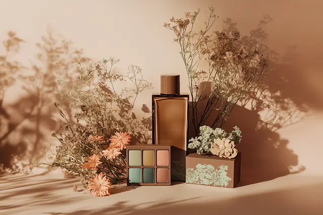
A look at Peach Fuzz and other ‘Colors of the Year’ through the years.
Colors are everywhere. Our daily lives are infused with them, from the changing colors of traffic lights to the shifting blues of the sky. Perhaps it is in their seeming ordinariness that many of us don’t think about colors that much.
But our relationship with colors goes beyond aesthetics. In many instances, they are chosen with deliberate consideration, imbued with meanings, nuances, cultural connotations, even religious significance as they always have been. Colors influence perceptions and emotions like few other things can.
At the core of each year’s choice is a celebration of the fundamental role color plays in history and our shared human experience.
The Chinese, for instance, associate red with luck. The LGBTQ+ pride flag incorporates the colors of the rainbow to symbolize diversity. In the Philippines, colors such as yellow and pink have strong political associations.
Colors can have psychological effects on individuals as well. Warm colors like red and yellow, for example, are often associated with energy and passion, while cool colors like blue and green evoke peace and quiet.
Artists throughout history, meanwhile, have used colors to convey themes and moods in their works. Similarly, art movements are characterized by specific color techniques, such as the earthy tones of the Renaissance, the pastels of the 18th century Rococo movement, or the bright colors of Pop Art.
Given the significance of colors in our lives, it is then with meticulous thought that color company Pantone chooses its color of the year. And “Peach Fuzz,” a soft, pinkish-orange hue is its pick for 2024, the company announced last week.
Beyond trendsetting


Every year, Pantone gathers a team of color experts to observe which colors are currently influencing the world from various vantage points: popular culture, art, fashion, design, travel, human psychology, and more. From all that research—more a year-long observation than just one-sit down discussion—they narrow down the options to one color they feel sets the tone for the year ahead.
In an interview with Laurie Pressman, vice president of Pantone Color Institute, she described the Pantone Color of the Year selection process as one that entails “thoughtful consideration and trend analysis.” “It is a culmination of the macro-level color trend forecasting and research that the global team involved with the Pantone Color Institute conducts year-round that informs this selection, as well as the colors that get included into our color trend forecasting products.”
Contrary to what some people might think, they approach the color selection in a “very pure way,” meaning no one on their global team comes to any Pantone Color of the Year discussion with a commercial agenda or personal preference.


This is why beyond trendsetting, at the core of each year’s choice is a celebration of the fundamental role color plays in history and our shared human experience. This is reflected in how, while the color experts—or “color anthropologists” as how Pressman likes to call them—come from different backgrounds and are based in disparate locations, they are always able to come to a consensus.
And Pantone 13-1023 Peach Fuzz gets their nod, a color described by the design and color authority as “velvety,” “gentle,” and “subtly sensual.” The pinkish-orange hue was chosen to reflect a ‘collective desire for respite.’
A color of compassion, empathy


Leatrice Eiseman, executive director, Pantone Color Institute, further explained how they zeroed in on Peach Fuzz as the color for 2024: “In seeking a hue that echoes our innate yearning for closeness and connection, we chose a color radiant with warmth and modern elegance. A shade that resonates with compassion, offers a tactile embrace, and effortlessly bridges the youthful with the timeless.”
Compared with this year’s bright and bold pink-red shade called “Viva Magenta,” Peach Fuzz is much subtler, like a gentle breeze caressing your cheeks. This is so because while 2023 felt like a coming out of a dark period of isolation, we are about to welcome 2024 with fierce wars fought both online and in the real world.
The choice then of a more understated hue is meant to reflect the “need for some quiet, some peace, some respite,” Eiseman said.
Pantone’s official website further described the color as conveying a “message of compassion and empathy,” values which the world sadly lacks. It’s also a color whose “gentle lightness and airy presence lifts us into the future.”
‘Colors of the Year’ through the years


This year marks the 25th anniversary of Pantone’s Color of the Year initiative. The annual announcements began in 1999 to engage the design community and color enthusiasts around the world in a conversation around color. “[It serves] to highlight to our audience how what is taking place in our global culture is expressed and reflected through the language of color,” said Pressman in the same interview.
Over the years, the choices have been a reflection of our collective mood—be it optimism or anxiety, excitement or confusion.
In 2022, in a first for Pantone, the team created a brand-new color as they did not have the exact right color they needed to convey the message of the time. This gave birth to Very Peri (Pantone 17-3938). The periwinkle blue color with violet-red undertones was chosen to express joy, optimism, and a sense of “reset” that was much needed in a world slowly emerging from a global health crisis.
2021 saw a break from tradition with Pantone choosing two colors: Ultimate Gray (Pantone 17-5104) and Illuminating (Pantone 13-0647). The combination of these two contrasting yet complementary colors was chosen to reflect the mood and challenges of the year 2020, particularly the pandemic and the need for strength and optimism.


The only other time there were two colors chosen was in 2016 with Rose Quartz (Pantone 13-1520) and Serenity (Pantone 15-3919), the color institute’s response to societal movements toward gender equality and fluidity, as well as a challenge to traditional perceptions toward color associations.
Classic Blue (Pantone 19-4052) was the choice in 2020, a timeless and elegant blue chosen for its calming and reassuring qualities, a relevant choice while the world was being gripped by fear by what was then a largely unpredictable disease.
Other colors of the year from 2010 to 2019 were: Living Coral, 2019 (Pantone 16-1546); Ultra Violet, 2018 (Pantone 18-3838); Greenery, 2017 (Pantone 15-0343); Marsala, 2015 (Pantone 18-1438); Radiant Orchid, 2014 (Pantone 18-3224); Emerald, 2013 (Pantone 17-5641); Tangerine Tango, 2012 (Pantone 17-1463); Honeysuckle, 2011 (Pantone 18-2120); and Turquoise, 2010 (Pantone 15-5519).
The inaugural Pantone Color of the Year was Cerulean Blue (Pantone 15-4020), a serene shade of blue that was chosen to reflect the anticipation for a new millennium and the desire for peace and tranquility in a fast-paced world. Interestingly, Pantone Institute at the time had data to support that blue is not only the leading color among designers, but that it also reduced heart rates and blood pressure.
Since then, the selection of a Color of the Year has become an annual tradition for Pantone, influencing product development and trends across various industries and serving as a reflection of the changing times.


